Content Manager Documentation
This documentation showcases each component and the varieties that it’s able to achieve. Every component has its settings (colours, themes, font size, etc) that could be adjusted according to your needs.
P.S. Any theme that are not mentioned in this documentation is currently unused, unless they’re needed for future improvements. Choosing these themes won’t break the page - just produces plain style.

Banners
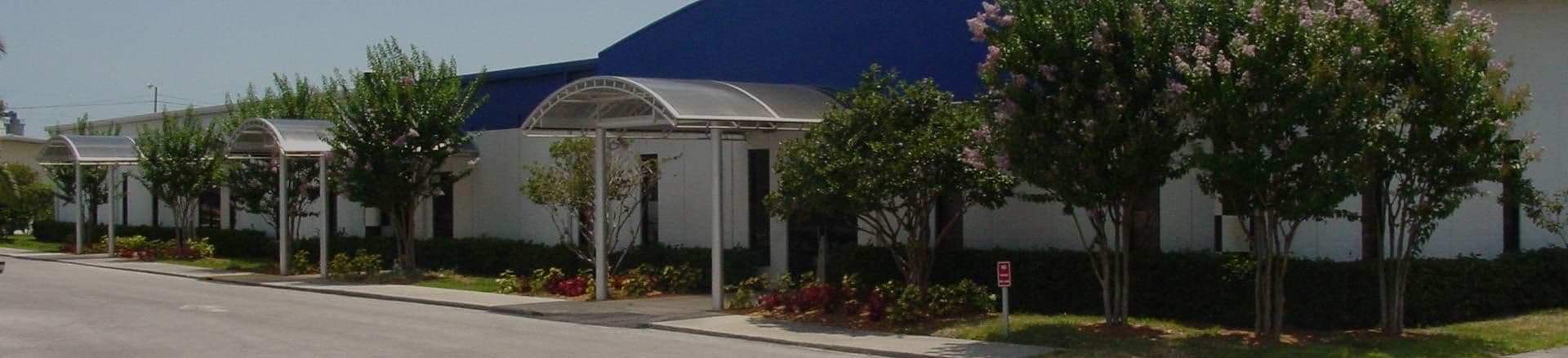
Banner - Theme 1
This is banner - theme 1.
Text is centered

Banner - Theme 2
This is banner - theme 2. Full height banner image, 50% (narrower) content, with black transparent background to the text area. Suitable for background images, and it’s nice when light text is applied. Try it yourself! ?

Banner - Theme 3
This is banner - theme 3. This one also hasFull height banner image, 50% width in bigger screen. The difference with the theme 2 is that this one does not have background on the text area.
Banner - Theme 4
This is paragraph in Banner Theme 4, set to 50% in width.
Background has shadow / shade
Banner - Theme 5
Banner Theme 5 has a top and bottom line. This is heading 3.
Content Blocks
Content Block - Theme 1
This is Content Block - Theme 1.
Content blocks are essentially contents in columnal layout. You can choose from two up to 5 columns, and all of them can be styled with any theme that you need. For example, this is theme 1.
Insert link here: example@example.com and here.
Content Block - Theme 2
Pam Argentina S.A.
Contact: Ángel J. Carranza 2386
C1425FXF
Ciudad Autónoma Buenos Aires
Argentina
Phone: +54 11 4775-4222
Email: example@example.com.ar
Website: example.com.ar/
Content Block - Theme 2
Pam Argentina S.A.
Contact: Ángel J. Carranza 2386
C1425FXF
Ciudad Autónoma Buenos Aires
Argentina
Phone: +54 11 4775-4222
Email: example@example.com.ar
Website: example.com.ar/
Content Block - Theme 2
Pam Argentina S.A.
Contact: Ángel J. Carranza 2386
C1425FXF
Ciudad Autónoma Buenos Aires
Argentina
Phone: +54 11 4775-4222
Email: example@example.com.ar
Website: example.com.ar/
Content Block - Theme 3
Data Sheet and Product Catalog
here in PDF format
Content Block - Theme 3
Content Block - Theme 3
Contetn Block - Theme 4
Text appear in the centre
Video in ContentBlock
Video in ContentBlock
Video in ContentBlock
Buttons
Buttons - Small Size
Buttons - Medium Size
Buttons - Large Size
Typography
Primary Color
Heading Extra Small
Heading Small
Heading Medium
Heading Large
Heading Extra Large
Secondary Color
Heading Extra Small
Heading Small
Heading Medium
Heading Large
Heading Extra Large
Accent Color
Heading Extra Small
Heading Small
Heading Medium
Heading Large
Heading Extra Large
Dark Color
Heading Extra Small
Heading Small
Heading Medium
Heading Large
Heading Extra Large
And this is how a regular paragraph looks like. You can also adjust the sizing and the colors too, just like the heading ones.
This is extra small size, accent color
This is small size, primary color
This is medium size, secondary color
This is large size, accent color
This is extra large size, primary color
Text Blocks
Textblock - One Content Column Layout - Theme 1
Lorem ipsum dolor sit amet, consectetur adipiscing elit, sed do eiusmod tempor incididunt ut labore et dolore magna aliqua. Ut enim ad minim veniam, quis nostrud exercitation ullamco laboris nisi ut aliquip ex ea commodo consequat.
And this is how a regular paragraph looks like. This paragraph using default text color.
Textblock - Two Content Column Layout - Theme 1
Lorem ipsum dolor sit amet, consectetur adipiscing elit, sed do eiusmod tempor incididunt ut labore et dolore magna aliqua. Ut enim ad minim veniam, quis nostrud exercitation ullamco laboris nisi ut aliquip ex ea commodo consequat.
And this is how a regular paragraph looks like. This paragraph using default text color.
Text Block - One Content Column Layout - Theme 2
Makes unordered and ordered lists flex containers. Items flow horizontally, but wrap to the next line if needed. Adds row 1rem and column 2rem gaps between list items.
Remove bullets, margins and paddings from list items. Each list item behave like an inline elements.
Text Block - Two Content Column Layout - Theme 2
Applies to paragraphs that contain strong tags and are not the last of their type.
Adds bottom padding 1rem for spacing.
Adds a subtle bottom border-like shadow using box-shadow for visual separation.
Color is pulled from a variable: $imp-secondary-text.
Plain Link
Text Block - One Content Column Layout - Theme 3

This is how paragraph looks like. Paragraphs have larger font and spacing for readability.
Images are centered with spacing.

Theme 5
Lorem ipsum dolor sit amet, consectetur adipiscing elit, sed do eiusmod tempor incididunt ut labore et dolore magna aliqua. Ut enim ad minim veniam, quis nostrud exercitation ullamco laboris nisi ut aliquip ex ea commodo consequat. Duis aute irure dolor in reprehenderit in voluptate velit esse cillum dolore eu fugiat nulla pariatur. Excepteur sint occaecat cupidatat non proident, sunt in culpa qui officia deserunt mollit anim id est laborum
H1 text in grey
Article Cards Section (for Blogs)
Article Cards - Theme 1
View All


Collection Cards (for Employees)